A Gentle Edit: Balancing Highlights, Shadows, and Color
A restrained phone edit starts with the brightest and darkest areas, then adjusts colour to suit the scene. Use this calm sequence to keep the photograph believable without forcing it into a preset look.
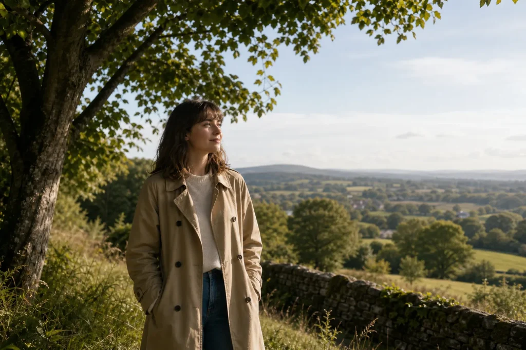
The most common editing mistake is reaching for saturation or a filter before checking the light. A blue sky can turn electric, skin can look orange, and a bright window can become a flat white patch; the photograph may feel less like the moment you wanted to keep. A gentler approach is to settle the bright and dark areas first, then make small colour decisions while looking at the whole image.
What should I adjust first?
Start with exposure, then look at highlights and shadows. In most phone editors, these controls sit near the top of the adjustment panel, though their names and behaviour vary. Exposure changes the overall brightness; highlights mainly affect the brightest parts, while shadows lift or deepen darker areas.
Try the smallest useful change rather than dragging a slider to its limit. If a face looks too dim but the sky already looks right, lifting shadows may help more than brightening the entire frame. If a white shirt seems to glow, lowering highlights can restore some texture without making the whole photograph gloomy.
Imagine you have a photograph of a friend standing beneath a tree, with a pale sky behind them. You lower highlights until the sky looks less harsh, then lift shadows just enough to show the face and coat. The expected visible result is a clearer subject and a less distracting sky, while the scene still reads as bright daylight.
Make one change, pause, and look at the image at its normal viewing size. A slider can make a small preview look pleasing while quietly flattening the photograph as a whole.
How do I keep bright areas from looking dull?
Lower highlights only until useful detail returns; do not assume every pale area needs to become textured. A lamp, reflection or cloudless patch of sky may naturally be very bright. Pulling highlights down too far can make that light source look grey and oddly heavy.
Check the brightest part against nearby tones. In Apple Photos, Google Photos, Lightroom Mobile and other editors, you can often compare the image before and after by pressing and holding the preview. Use that comparison to notice whether the scene still feels like it was lit in the way you remember.
If the brightest area remains blank, that may be acceptable. The goal is not to manufacture detail that is not visible in the file; it is to keep bright areas from pulling attention unnecessarily.
How far should I lift the shadows?
Lift shadows until the important dark detail is readable, then stop before the image loses its sense of depth. A shaded doorway can remain dark, and hair or a black jumper does not need to reveal every strand or fold. Darkness is part of the photograph, not automatically a flaw.
After lifting shadows, inspect darker areas for grain, colour blotches or a washed-out look. Phone files can show more noise when very dark regions are brightened. If that happens, ease the shadow adjustment back rather than trying to make every corner equally clear.
It can help to zoom out after checking a detail close up. A face may benefit from a small lift, while the same adjustment across the whole frame can make the background seem flat.
Should I change contrast before colour?
Make a modest contrast adjustment before fine-tuning colour, if the photograph needs it. Contrast changes the separation between light and dark tones, so it can affect how strong colours appear. A little added contrast may give a hazy image definition; too much can deepen shadows and make bright areas harsh again.
Do not treat a particular contrast setting as a rule. A soft portrait, a misty landscape and a photograph made in hard afternoon sun may each suit a different tonal balance. Keep the original scene in mind, not a preset look you feel obliged to imitate.
For a simple check, toggle the contrast change on and off. If the subject becomes easier to read without losing the gentle transitions in the light, keep it. If the image starts to feel brittle, back it off.
How can I correct colour without losing the scene?
Begin with white balance, then decide whether colour needs any further adjustment. Temperature moves the image towards warmer yellow or cooler blue; tint shifts it towards green or magenta. Make the correction by looking at something that should be neutral, such as a white mug or a grey pavement, while remembering that neutral objects can reflect coloured light.
Do not neutralise all the warmth from a late-afternoon photograph just because a wall looks yellow. That warmth may be what makes the light feel true. Likewise, a cool indoor scene can look natural under overcast window light, even if it is not perfectly neutral.
Once white balance feels plausible, check saturation or vibrance only if the colours still seem out of place. These controls can affect the whole frame, so look at skin, foliage and strong colours separately. If a red jumper becomes the first thing you notice, reduce the colour adjustment rather than chasing a more dramatic effect.
What should I do when skin or foliage looks wrong?
Use the least broad adjustment that solves the problem. If your editor offers selective colour controls, reduce an overly strong orange or green gently; otherwise, return to global saturation and white balance. A small overall correction often looks more coherent than making one colour vivid and leaving everything else muted.
For skin, check both warmth and brightness before changing saturation. A face that appears orange may be too warm, too saturated, or affected by reflected light from nearby walls. Change one control at a time so you can tell which adjustment is helping.
Foliage can look unnaturally intense after a modest saturation boost, especially in bright sun. If leaves dominate the picture, back off the global colour change and consider whether a slight crop or tonal adjustment would restore the subject’s place in the frame.
How do I know when the edit is finished?
Stop when the photograph feels clear and plausible, not when every area has been optimised. Compare the edited version with the original, then take a short pause and look again at normal size. Notice whether the light still has direction, the subject remains easy to see, and colours belong to the same scene.
Check the image on a neutral screen setting if you can. A very bright display can make edits seem darker than they are, while a warm screen setting can affect your judgement of white balance. You do not need specialised equipment; simply avoid making final decisions while the screen is set unusually bright or tinted.
If you are unsure about a strong adjustment, reduce it. A restrained edit leaves room for the photograph to feel like your memory of the moment, without insisting on a single style.
Should I save a copy before editing?
Keep the original available, especially if your phone editor allows you to revert edits or save a duplicate. That gives you room to reconsider a choice later without treating the first version as lost. Check how your app handles edits before committing changes, since saving and reverting work differently across devices.
When you revisit the image, compare versions rather than continuing to add adjustments out of habit. If the newer edit has stronger colour but weaker light, return to the earlier version and change only what still bothers you. A gentle edit is not a fixed recipe; it is a series of small decisions that preserve what matters in this particular photograph.